Compare Performance Across Oregon Districts
A statewide district comparison that keeps full score-level context visible.
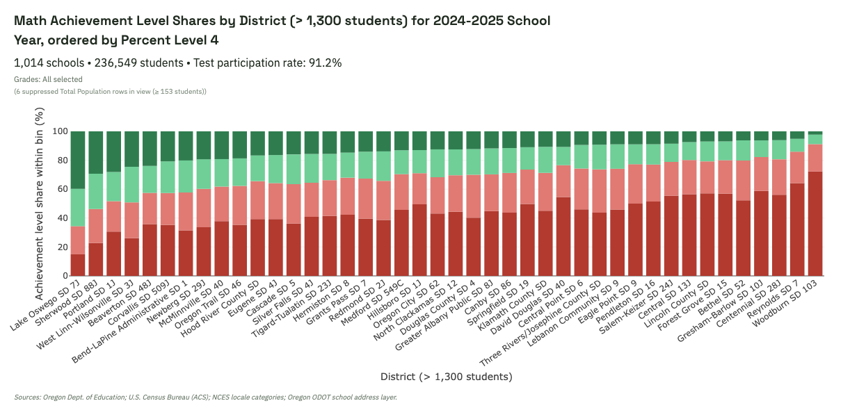
What this shows
Districts are ordered by Percent Level 4 while each bar still shows the full Level 1–4 mix. This helps compare both top-end performance and lower-level concentration at the same time.
What to look for in the live view
- How much Level 1 expands as Level 4 contracts across districts.
- Whether Level 2 and Level 3 stay relatively stable or also shift substantially.
- Districts with similar Level 4 values but very different lower-level distributions.
Interpretation caution: District-level differences are descriptive patterns. They can reflect demography, enrollment composition, suppression effects, and multiple policy/context factors.
Explore this view live
Ready to test this pattern yourself? Open this exact dashboard view, then adjust filters and compare alternatives.