Adult Education and Student Test Performance
A statewide school-level view of how local adult education levels track math proficiency.
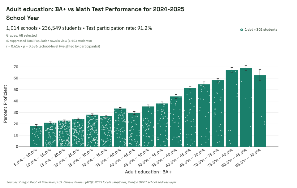
What this shows
As local adult BA+ rates rise, student math proficiency generally rises too. The pattern is mostly gradual rather than step-like, which argues against a single "magic threshold." Each white dot inside a graph bar represents 301 students. The distribution of dots across the whole graph shows that most children go to schools where fewer than 40% of students are "proficient" in math.
What to look for in the live view
- Whether the upward pattern remains across most bins, not just the tails.
- How much the slope changes when you filter by grade span, locale, or district.
- Where uncertainty widens because scored-student counts are smaller.
Interpretation caution: This is a school/community-level association. It does not establish individual-level causation.
Explore this view live
Ready to test this pattern yourself? Open this exact dashboard view, then adjust filters and compare alternatives.